CSD/waterfall & spectrum
home
back to Learn
back to How to interpret graphs
published: Mar-18-2017

waterfall plot or CSD
Waterfall or C.S.D. (Cumulative Spectral Decay) plots give you SOME information about how fast the headphone stops making sound AFTER the signal has been stopped. There is a TIME factor involved. Each material has it’s own resonance(s) which means that if we move a material it does not ‘stop’ moving immediately after the stimulus (an audio signal transient) is no longer present. This is the Decay part. The lighter a membrane the less mass it has the easier it will stop it’s movement.
At certain frequencies a material can stop moving quite fast BUT at other frequencies (can occur in various parts in the entire audio Spectrum it may resonate for a while longer. The higher the amplitude of that resonating signal the LOUDER it is.
These 3 ‘ingredients’ are displayed in ONE single plot in the C.S.D.
The time factor runs from back to front in most plots.
For frequencies above 500Hz a useful time scale is about 5ms (milli-seconds).
So in the ‘rear’ of the plot we see 0ms and shows the actual amplitude of the stimulus just before it is being switched ‘off’.
The further we come to the front of the plot the more time has past.
Ideally the waterfall should drop down instantly BUT the filters used also need some time so a plot without any mechanical signals will not be a flat wall but look more like a real waterfall.
The frequency spectrum is shown from left to right with on the left the lowest frequencies and on the right the highest ones. Note that the usable frequency range of a CSD does not run as low as the frequency plot and the information below 500Hz usually isn’t meaningful due to the way the CSD is created (caused by sharp digital filtering/calculations)
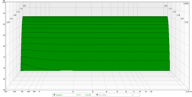
Below an interesting CSD of the soundcard itself (loopback EMU0204). At a first glance it takes almost 1ms for each frequency to drop 30dB. In reality, however, the signal ‘drop’ is instant. What is seen here is the minimum slope of the filters in REW (the program used to make these plots). Filter used is Blackman-Harris 7 with 1ms risetime and 6ms window.
The amplitude of the signal (and thus how loud that frequency is at a certain point in time) is shown from top to bottom. On the top the loudest sound below the softest sound. Due to noise around the headphone and the used equipment it is rather pointless to measure well below -35 dB (seen from the highest amplitude) so the amplitude range is usually limited to around -35dB (-30dB in the plot above). Of course it isn’t dead quiet below the bottom of the graph but 35dB of dynamic range is really a LOT already so a ‘common’ range seen in lots of independent measurements.
Below the CSD of a stock HE400i… let’s have a look and analyse what is seen.
In the BACK of the plot we can see the vertical lines of the frequency scale. Each line corresponds with the frequency shown in the bottom of the graph.On the LEFT of the plot we can see the amplitude scale in 5dB divisions. From the back to the front we can see the time scale. The time divisions are almost 1ms so when we look in the front of the plot 5ms has passed from the moment the electrical signal has stopped.
In theory the ‘line’ you see should be closely the same to that of a normal frequency plot. A perfect headphone (and perfect CSD plot program) would look like a sharp falling edge only in the back of the plot (0 ms after the signal stopped) and should look like a sharp drop of a waterfall. In reality this isn’t the case as materials resonate and thus do NOT stop moving suddenly. It takes TIME for the membrane to stop and the amplitude tells us how quiet it has become after a certain amount of time at a certain frequency.
At around 4kHz the plot reveals that it takes the membrane at least 4ms to lower the amplitude 35dB below the 90dB level at 1kHz. At 9kHz there is a narrow bandwidth resonance visible which also takes about 4ms to drop below the 60dB SPL floor.
In short: a good headphone does NOT exhibit resonances that ‘ring’ for a relatively long time period (above 500Hz they should remain below 2ms before they have dropped 30dB in amplitude). So the better headphones should have a ‘wall’ of a waterfall drop as far in the back as possible. Ridges present at or near the front of the plot (even when already low in amplitude) are NOT desirable.
Long resonances usually indicate an issue in that specific part of the frequency range and may mean that the headphone doesn’t resolve very well in that part of the frequency range.
Very narrow resonances (such as the one at 16kHz) may well not be very audible as that frequency isn’t always ‘excited’ in all music.
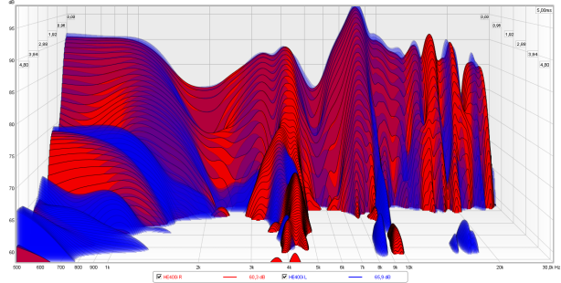
The spectrum plot below is another form of the CSD/waterfall plot but is not shown in 3D.
Well.. it still is sort-of 3D but the 3rd dimension here is shown in color (SPL). The legends are on the right. Where the CSD plot shows the expired time towards the front the plot below shows time upwards. On the bottom of the plot the stimulus (signal) is still maximum SPL.
The higher we go in the plot the more time has passed. The time passed (in ms) is shown on the left of the plot.
Where in the CSD the time frame was only 5ms and the amplitude range was 35dB (from 1kHz =90dB SPL) the plot below has an amplitude range of 55dB and a time frame of 50ms.
Also the frequency range shown is wider. Down to 100Hz in the spectrum plot but only down to 500Hz in the CSD.

The plot above is from the Fostex TH-X00 (Mahogany) which measures quite well across the board but has a weird resonance just below 2kHz. This isn’t audible because the membrane stops fast and drops 45dB within 3ms but lingers on at a lower level for many more ms.
The spectrum plot thus is another tool to access time domain aspects in the entire frequency range. Much like the CSD and the squarewave plots as well as the impulse/step response plot. It just displays it in another form which may also give some clues in evaluating the total sonic signature based on all plots combined.
