smoothing & compensation
home
back to Learn
back to How to interpret graphs
published: Mar-18-2017

smoothing
Another way to create more flattering plots is to use ‘smoothing’. Smoothing is basically smearing out narrow and or high peaks or dips so they appear ‘smoother’. One might ask why smoothing is done. This is for a few reasons. One of them is because narrow peaks and dips are not perceived as such and smoothing the plot is closer to what we perceive. Another reason to use smoothing is to ‘remove’ measuring artifacts such as very narrow peaks/dips that are not there in reality but might be visible in a measurement. A third reason would be for sales purposes. Plots with a smoother FR are easier to sell than non smoothed.
An example of smoothing is shown below.

This plot has 4 traces in it of the exact same headphone (Grado SR125). There are several degrees/types of smoothing. The read trace is the ‘raw’ measurement, no smoothing is applied. The blue trace has psycho-acoustic smoothing applied. This smoothing will create plots that still shows peaks but the small ripples are removed. Sharp peaks and dips appear just slightly less deep and shows how it is perceived. This type of smoothing is almost never used. 1/3 octave smoothing is used quite often. The resulting plot shows less peaks and dips and is more suited when you want to sell the headphone and not show problem areas that much. When 1 full octave smoothing is used dips and peaks are removed and all that is left is an average indication of tonal balance. In this case it shows the headphone is bright sounding but doesn’t show any problem areas.
Smoothing can help ‘polishing’ plots and help in showing the general tonal balance.
It also removes measured peaks and dips. These peaks and dips MAY be measurement artifacts and not really be (that) audible. In that case smoothed plots may be more accurate.
But removing peaks and dips in plots that are really there and show actual problem areas of that headphone is not really desirable when we want to see everything, warts and all.
For that reason plots on this website have no smoothing applied unless clearly stated and for a specific reason.
Diffuse field, near field, Olive-Welti and other ‘corrections’
A speaker that has an ideal flat reproduction will sound different in a ‘normal’ listening room because lower frequencies also bounce of walls (including the rear wall they are placed near) and thus get kind of amplified.
the highest treble get slightly damped because speakers sometimes are not pointing to the listening spot and are direction sensitive. Because of these reasons a speaker that measures flat on 1meter distance in an anechoic room will be measure somewhat tilted along the lines of the green plot. Of course due to room reflections and room geometries as well as things in the room especially the area between 25 and 100Hz will vary MUCH more and can have peaks/dips in the order of 10dB or more. The green line is an average estimation of the effect and so is the drop in highs.

If you were to position ideal flat speakers 1 meter on each side of your head the perceived frequency response would be closer to the red line. Well headphones can be considered as small wide-band speakers strapped on your head with the exception that there are no reflections.
If an ideally flat headphone would exist and follow the red line we would perceive it as a slightly lean on the bass and slightly brighter than when we would be listening to the same music played from perfectly flat speakers in a listening room from several meters distance. Recordings are often monitored/mixed with this natural occurring effect in mind.
For this reason there is a LOT of debate on how headphones should sound IF we want the sonic character to resemble speaker reproduction.
There seems to be little consensus about this. There is another effect as well and that is we ‘feel’ the bass part also with our skin which doesn’t happen when listening to headphones. For that reason some believe bass should be reproduced somewhat louder even than a room correction curve suggests.
Golden Ears used has a target curve that shows this effect and do feel that this proposed target curve sounds better than the usual ‘average’ room correction plots including the old and well known Brüel & Kjaer curve.I tend to agree with the 5dB increase for the lows, certainly when music is played at softer listening levels. As soon as the listening level increase to ‘realistic’ levels I find that I do not need that much increase in lows. The reason for this is found in the Phon curves. Recently Harman Kardon (Now owned by Samsung) has done some research on which ‘known’ headphones are preferred by listeners. They found a curve that is preferred by the vast majority of people (regardless of age, musical preference and the continents the listeners live in. This too shows a higher increase in bass but differs in that is closer to room correction plots up to 2kHz. It also seems to show a preference for a slight decrease around 2-3kHz and an increase in the 5kHz to 8kHz region. My personal guess is that this is caused by using real world headphones that on average show a slight reces in the 2-3kHz area and a peak in the 5-8kHz region with a drop-off above 15kHz. Because of this property of most headphones this ‘wiggle’ is introduced in these plots.
Below the well known ‘target’ curves. As you can see they all have the same thing in common (a slight downward slope from 50Hz to 20kHz of around 6dB. The Golden Ears one is closest to my personal preference followed by the Olive-Welti speaker curve. The O-W curve is an exaggerated GE curve for the frequencies below 1kHz and more or less following the B&K curve/room curve above 1kHz.
I don’t think there is really an ideal curve as that would also be listener depending (taste, music/recording dependent).
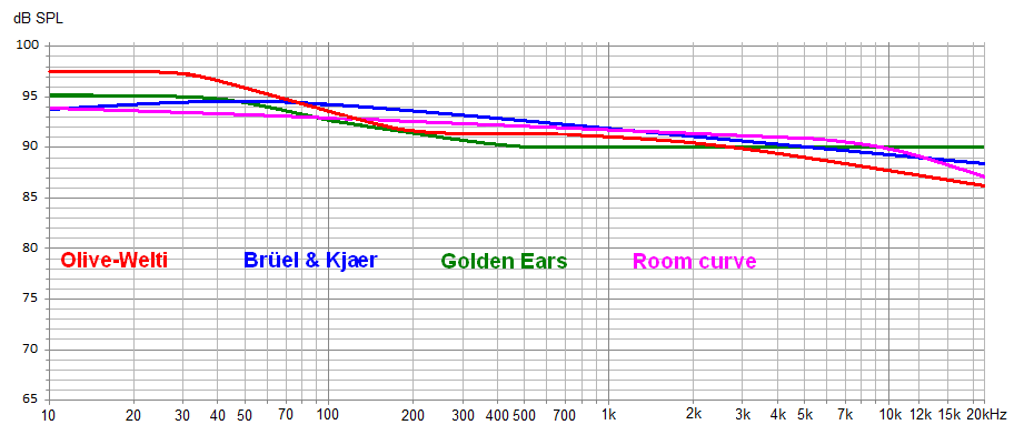 A sloping curve may be close to ideal for some. From 1kHz up I think it should be quite ‘flat’. Something between the GE and O-W curve above up to 1kHz will sound most realistic, with a flat reproduction from 1kHz and up when music is mostly played softly.
For those that usually play a little bit louder one doesn’t need that much bass lift and the purple curve comes closer to the ideal in my opinion. For those that like to play their music at ‘real’life’ levels the orange plot may be closer to realistic.
When music is played at realistic levels on a headphone with the greenish signature it may sound too warmish/bassy where the orange or even purple signature may sound too ‘thin’ when music is played softer.
A single ‘optimal’ correction plot is hard to defend this way but could be anywhere around these suggested average frequency plots.

As the test-rig used on this website is a flat-bed type and doesn’t have a fake Pinna nor simulated ear canal and not much ‘compensation’ is needed aside from the microphone itself which has a small boost around 16kHz. This is compensated for in all the plots.
Aside from the small correction in the treble also some compensation is used for the lower frequencies. Because lower frequencies are not only heard by ear but also with the body itself some extra bass is needed if we want to hear the bass at the same level. This has nothing to do with Fletcher-Munson (Phon) curves but with the way our brains process incoming sound-waves. This phenomenon has also been studied by Sean Olive and Todd Welti. They came up with a +4dB boost below 60Hz (for headphones) which is quite similar to my findings and those of Golden Ears. Below the plot of the applied compensation.

This means that when a headphone measures as a ‘flat’ line in the plots on this website the actual raw measured response had about 4dB more bass.
A ‘flat‘ line in the frequency response plots on this website sounds ‘flat’ because it has a small bass lift compensating for the perceived loss of bass in headphones.

home
back to Learn
back to How to interpret graphs
